Fading isn't blurring
A progressive blur is the soft edge under a frosted header, or at the bottom of a lyrics screen where the lines drift out of focus. It should move from sharp to soft without ever looking like a second image laid on top.
The obvious implementation is one backdrop-filter, faded in with a gradient mask. One element, two lines of CSS. It is also the wrong mental model: a mask changes how much of a blur you see, not how strong the blur is at that point.
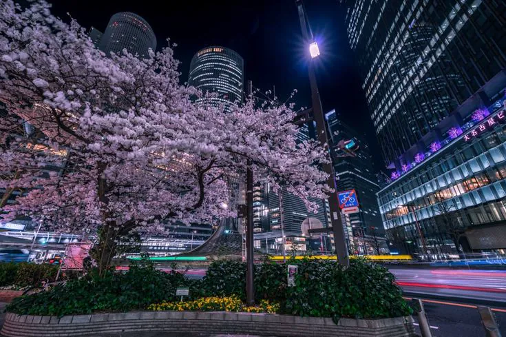
In the middle of the fade, the sharp photo is still underneath the blurry copy. Look at the street lights: crisp dots sitting inside their own glow. It reads as a smudge, or a double exposure, rather than something slowly going out of focus.
The stacked version keeps the same start, end and maximum blur. It only changes the path between them.
What the mask does
A mask decides how much of the blur you see. It doesn't decide how much blur there is.
Halfway down the mask, you get half of the full 24px blur laid over the sharp original. What you wanted there was one 12px blur. Slide along the fade to compare the two interpretations.
At the two ends they agree. Everywhere in between, the masked version keeps every sharp edge, just fainter, with a glow around it. That's the ghosting.
Stack it up
The fix is a few smaller blurs instead of one large blur. Each layer starts a little lower than the one before and stays on to the bottom. The mask is only a tiny ramp at that seam; it is there to stop a hard line, not to fake a smaller blur. Where the layers overlap, the blurs pile up, so the further down you look, the softer it gets.
That is the trick in Jhey's demo: progressive blur is stacked blurs with a tiny bit of masking to smooth the seams. The blur does the actual work. The mask just makes the joins less obvious.
3
layers
24px
final blur
8.0–17.9
px per layer
100%
layer gap
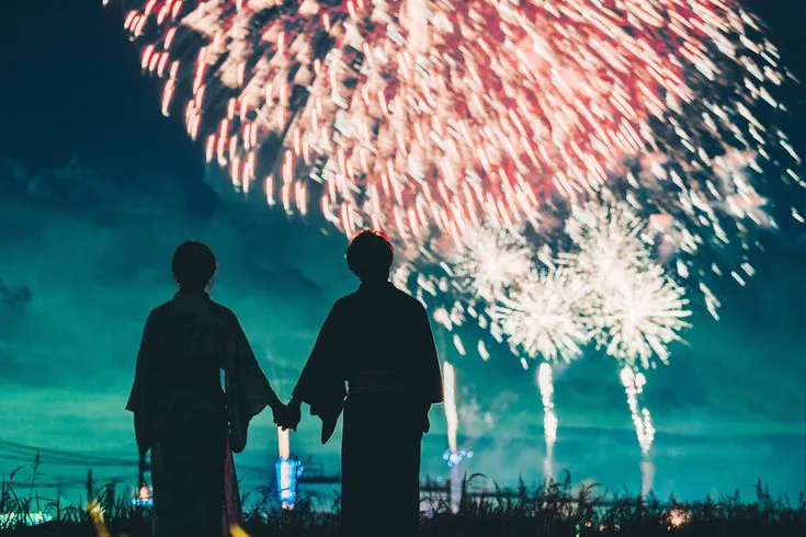
With "show layers" on you can see where each one starts and how much it adds. Try tightening the layer gap too. Close starts can look better on a short fade because the layers overlap gently; wider starts spread the transition out, but can reveal steps. The readout below the card is the useful constraint: every layer is another full blur for the browser to draw. Two or three leave visible steps; around four or five they disappear. Past six, you are mostly paying for layers no one can see.
Blurs add up in squares
Stacking two blurs doesn't add their sizes. A 6px blur on top of an 8px one gives you 10px, not 14. Blurs combine like the sides of a right triangle1.
That matters when you pick the numbers. If the stack should grow evenly and land on exactly 24px, each layer adds the difference between where the stack is and where it should be next, measured in squares. That's where the odd-looking values in the demo come from. The gap control changes where those layers begin, not the blur math itself. Drag the controls and watch the first and last layer change independently. I picked this up from Jhey's demo2, which shows every layer's value as you drag.
Give it something to fade
There are two common ways to finish a fade. A progressive blur keeps the scene visible while it becomes softer. A white fade hides the scene and leaves a clean surface for text. They can occupy the same space, but they solve different problems.
Here is the blur version first. Use the layer control to see how several small blurs build one smooth edge.

Osaka, after rain
A soft landing for the last few lines.
It isn't only for photos
The same idea works on more than photographs. Switch the card below to Text to see a soft gray-to-white surface, then turn on white fade to compare it with the blur.
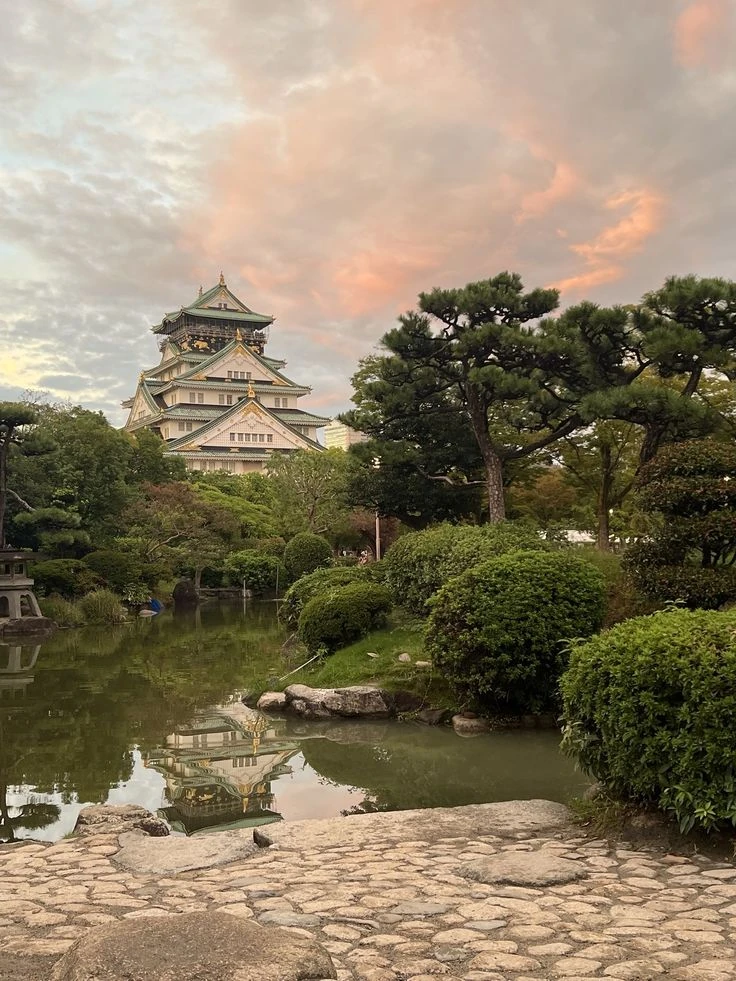
Osaka, after rain
A soft landing for the last few lines.
A blur needs visual detail to soften, so it has less effect on a plain gradient. A white fade is better when text needs to sit on a clean background: it removes the image instead of making it fuzzy.
Move it
A still photo is the forgiving test. Motion is the real one. This list is deliberately rounded and fades at the edge so you can compare the three finishes without any square corners.
// How much blur each layer adds, so the stack grows evenly to `final`
function layerBlurs(final: number, count: number) {
  return Array.from({ length: count }, (_, i) => {
    const before = (final * i) / count;
    const after = (final * (i + 1)) / count;
    return Math.sqrt(after ** 2 - before ** 2);
  });
}

layerBlurs(24, 4); // [6, 10.4, 13.4, 15.9]
Here's that four-layer stack as plain HTML and CSS. Each layer carries its own blur, while its mask only eases in around the seam before staying solid. Put it over anything inside a parent with position: relative.
<div class="progressive-blur" aria-hidden="true">
  <div style="--blur: 6px; --from: 30%; --to: 36%"></div>
  <div style="--blur: 10.4px; --from: 50%; --to: 56%"></div>
  <div style="--blur: 13.4px; --from: 70%; --to: 76%"></div>
  <div style="--blur: 15.9px; --from: 90%; --to: 92%"></div>
</div>.progressive-blur,
.progressive-blur > div {
position: absolute;
inset: 0;
pointer-events: none;
}
.progressive-blur > div {
backdrop-filter: blur(var(--blur));
mask-image: linear-gradient(
to bottom,
transparent var(--from),
black var(--to),
black 100%
);
}Ease the ramp
There's one more thing to hide. A straight gradient has two creases: where it starts and where it stops. Your eye is very good at spotting a sudden change in slope, so a fade you meant to be invisible gets a faint line across it at each end3.
Easing fixes it. Instead of two stops, use a handful that follow an ease-in-out curve, so the fade starts and finishes gently.
This matters most for the dark tint people put under a blur to keep text readable. A blur hides its own creases. A flat tint shows every one. The same idea works on the blur too: run the layer values through an ease instead of a straight line, and the blur starts slower and finishes softer.
Keep in mind
- A mask fades a blur. It can't make it smaller, so one masked blur always ghosts.
- Stack a few layers, each starting lower and adding a little more.
- Blurs add up as √(a² + b²). Work out each layer's share from the total you want.
- Four or five layers is usually enough. Each one is a full blur to draw.
- Ease your gradients, masks and tints included, so they don't crease where they start and stop.
Resources
- Two Gaussian blurs in a row equal one blur whose size is the square root of the sum of their squares, and CSS
blur()is a Gaussian. Wikipedia, Gaussian blur. Read more - Jhey Tompkins' progressive blur demo, which builds the blur up on a curve you can drag. Read more
- The bright and dark lines you see there are called Mach bands. Read more